Showing posts with label Css3. Show all posts

Tuesday, 22 September 2015

Amazing CSS attribute Selector with substring matching selection

CSS attribute Selector


If you have learned html and css, you must be aware of how to target element with id or class in css.

<p id="demo_id" class="demo_class"> </p>

above element has id and class which you can use in css to target p element as "#demo_id" and ".demo_class". But apart from these selectors you can select element with other attributes using attribute selector.


<p id="demo_id" class="demo_class" rel="name" title="name of Jon"> </p>

In above P tag we can see attributes other than class and id, like "rel", "title". So it is possible to us to user these attributes for selecting perticuler P tag.


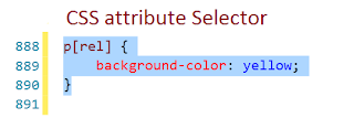
p[rel] {
    background-color: yellow;
}

this css will target p tag which has rel attribute and change its background color to yellow.

It is also possible to use attribute with value. Let's see another example. If we have two P tags


<p rel="name">Rajesh</p>
<p rel="email">rajesh@something.com</p>

And in css if we write


  p[rel="name"]{
    background-color: yellow;
}


Then this css will be apply for the p tag with rel has value "name".


Attribute selector has lot more option to do. Let's take a look at these.

Above example is attribute with exactly match value.


[attribute~="value"] Selector.

The [attribute~="value"] selector is used to select elements with an attribute value containing a specified word.

The following example selects all elements with a title attribute that contains a space-separated list of words, one of which is "image":

<img src="image1.jpg" title="small image " width="150" height="113">
<img src="image2.jpg " title=" image " width="224" height="162">


[attribute|="value"] Selector

The [attribute|="value"] selector is used to select elements with the specified attribute starting with the specified value.

The following example selects all elements with a class attribute value that begins with "top":

Note: The value has to be a whole word, either alone, like class="top", or followed by a hyphen( - ), like class="top-text"!


<h1 class="top-header">Welcome</h1>
<p class="top-text">Hello world!</p>
  

[attribute^="value"] Selector

The [attribute^="value"] selector is used to select elements whose attribute value begins with a specified value.

The following example selects all elements with a class attribute value that begins with "top":

Note: The value does not have to be a whole word!

<h1 class="top-header">Welcome</h1>
<p class="top-text">Hello world!</p>
<p class="topcontent">Are you learning CSS?</p>


[attribute$="value"] Selector

The [attribute$="value"] selector is used to select elements whose attribute value ends with a specified value.

The following example selects all elements with a class attribute value that ends with "test":

Note: The value does not have to be a whole word!


<div class="first_test">The first div element.</div>
<div class="my-test">The third div element.</div>
<p class="mytest">This is some text in a paragraph.</p>


[attribute*="value"] Selector

The [attribute*="value"] selector is used to select elements whose attribute value contains a specified value.

The following example selects all elements with a class attribute value that contains "te":

Note: The value does not have to be a whole word!


<div class="first_test">The first div element.</div>
<div class="second">The second div element.</div>
<div class="my-test">The third div element.</div>
<p class="mytest">This is some text in a paragraph.</p>


Wednesday, 8 October 2014

10 Responsive Html5 - Css3 website templates free

SquadFree – Bootstrap Free HTML Template


Sublime – Stunning HTML5/CSS3 Website Template


Timber – Free One Page Bootstrap Template


E-Shopper – Best Free Ecommerce HTML Template


AdminLTE Dasboard and Control Panel Template


Magnetic – Free Photography Website Template


Mabur Portfolio Theme


Modern Bootstrap HTML Template


Sport Business Html Template


Crafty – Corporate HTML Template


Monday, 29 September 2014

Simple Jquery Accordion div for your website

Accordion is expandable and collapsible content holder that is broken into sections and probably looks like tabs. On net you will get plenty of Accordion plug-ins which are with their complicated structure and heavy js files. So they are hard to modify   as per your requirement.


I am writing here a simple and light weight jquery accordion. This is basic structure with scope of modifications. So try this out.

<!DOCTYPE html PUBLIC "-//W3C//DTD XHTML 1.0 Transitional//EN" "http://www.w3.org/TR/xhtml1/DTD/xhtml1-transitional.dtd">
<html xmlns="http://www.w3.org/1999/xhtml">
<head>
    <title>Accordion</title>
    <script src="http://code.jquery.com/jquery-1.11.0.min.js" type="text/javascript"></script>
    <script type="text/javascript">
        $(document).ready(function () {
            $(".accordiondiv h1").click(function () {
                $('.active').removeClass('active');
                $(this).addClass('active');

                $(this).siblings('.accordionbody').slideToggle();


            });

        });
    </script>
    <style>
        .accordionbody
        {
            display: none;
            border: 1px solid;
            padding: 8px;
        }
        .accordiondiv h1
        {
            background-color: #333;
            color: #fff;
            font-weight: normal;
            padding: 10px;
            font-size: 17px;
            margin: 0;
            border: 1px solid;
        }
    </style>
</head>
<body>
    <div class="maindiv">
        <div class="accordiondiv">
            <h1>
                accordion 1</h1>
            <div class="accordionbody">
                some text here
            </div>
        </div>
        <div class="accordiondiv">
            <h1>
                accordion 3</h1>
            <div class="accordionbody">
                some text here
            </div>
        </div>
        <div class="accordiondiv">
            <h1>
                accordion 4</h1>
            <div class="accordionbody">
                some text here
            </div>
        </div>
    </div>
</body>
</html>


Saturday, 20 September 2014

Components required for responsive web designing


Responsive web design (RWD) is a web design approach aimed at making websites change itself to provide an optimal viewing experience—easy reading and navigation with a minimum of resizing, panning, and scrolling—across a wide range of devices (from mobile phones to desktop computer monitors).

That means make your website to adjust itself as per viewer's screen resolution or device such as mobile or desktop. In this way you can increasing user experience of your website. In this discussion we are going to take look at components that requires to build responsive website.

1)View port
2)css media queries

View port
View port is very important component for your responsive Website. Without it your website can not show phenomena of responsiveness on mobile devices.

View port actual reads width of device and ask browser to do responsive things. View port lies between head tags of your html code.
<meta name="viewport" content="width=device-width, initial-scale=1.0">


Css3 Media queries

Css3 media queries are introduced to targeting different sizes of devices or view port. Basically this gives you to build css to target specific width's devices. Means you can write style separately for mobile devices, tablets and desktops. In this way website fits to that specific device perfectly. But you should design your website differently for each set of devices.

You can include media queries in three ways to your webpage.
1)In the head tag of html you can import different style sheets for different widths of devices, like this
<link href="styles.css" rel="stylesheet" media="all and (max-width: 1024px)">


2)Or you can import external style sheet inside your existing style sheet
@import url(styles.css) all and (max-width: 1024px) {...}


3)Or you can write rules for different media queries inside your single style sheet
@media all and (max-width: 1024px) {...}

Most experts recommend the 3rd one that means write media queries in side your one single css style sheet. Because importing external style sheets may increase your page request, which may cause slowdown your page to load.

Each media query may include a media type. Common media types include all, screen, print, tv, and braille. The HTML5 specification includes new media types, even including 3d-glasses.Screen is default media type if not specified. Way to write media type is
@media only screen {}

@media only print {}


Style you want to apply for screen media (like desktop, mobile etc) go inside '{}' and same for print media.

For responsive website it is necessary to write different styles for different width of screen. So media query gives you that option. You can write it like this
@media only screen and (min-width : 320px) and (max-width : 480px) {
/* Styles */
}


The style written in this media query will apply for screen with width between 320px to 480px.
We can also write in this manner given below
@media only screen and (min-width : 320px){
/* Styles */
}

This will apply style only for screen with above 320px. Here we are not restricting max screen width.
@media only screen and (max-width : 320px) {
/* Styles */
}

This will apply style for screen with below 320px. That means this will never apply for screen width above 320px

Now like this you can write style for specific conditions you need. You can add as many media queries in style sheet you want.

I hope this will help many beginners in responsive web designing.
I next session I am going to discus recommended breakpoints or screen sizes for media queries.


Wednesday, 16 July 2014

Auto flipping text with css3 and javascript

We know since Html5 and Css3 arrived we can do lots of fun effect in our webpage. In css3 we have different animations and transition effects that's gives us an easiest ways to do webpage more interactive.

There is a property in css3 that is called as transform. There are two kind of transform 2d transform and 3d transform. In this post I am going to use 2d transform for Flip effect.

In this flip effect I want it to flip text panel automatically, which will have two different content on both sides front and back.

First of all we are going to build Html structure for it.


   <div id="flipPanel">
                              <h3 id="header1" class="face">Front text </h3>
                         
                              <h3 id="header2" class="face back" style="display:none;">Back text</h3>
                        </div>

I am using h3 for my text. You may try this with div also and do deterrent design.

We are making two sides of the panel here. So here am  using one main div which content two h3. Let's add css.


#flipPanel {
   -moz-transform-style: preserve-3d;
   -moz-transition: all 1s linear 0s;
    transform-style: preserve-3d;
    transition: all 1s linear 0s;
    -webkit-transform-style: preserve-3d;
   -webkit-transition: all 1s linear 0s;
   
    float: left;
   height: 18px;
    margin-top: 31px;
   width: 100%;
   position:relative;
   
}

.face {
   -moz-backface-visibility: hidden;
   -webkit-backface-visibility: hidden;
    backface-visibility: hidden;
    margin:0;
    position:absolute;
  
}
.face.back {
   -moz-box-sizing: border-box;
   -moz-transform: rotateX(180deg);
   -webkit-box-sizing: border-box;
   -webkit-transform: rotateX(180deg);
   box-sizing: border-box;
   transform: rotateX(180deg);
   
}


This will build your basic structure. You can see only one text instead of both. Because we have flipped panel already and back side is hidden. But this will not play automatically.

For auto play we have to use Jquery part for it.

 <script src="../js/jquery-1.7.1.min.js" type="text/javascript"></script>

  <script type="text/javascript">
 Triggerh1 = 0;
          rotatAmnt = 180;
          var myVar = setInterval(function () { showH1() }, 5000);
          function showH1() {
              if (Triggerh1 == 0) {
                  Triggerh1 = 1;
                  $('#flipPanel h3').slideToggle(1000);
                  $('#flipPanel').attr('style', '-moz-transform: rotatex(' + rotatAmnt + 'deg);-webkit-transform: rotatex(' + rotatAmnt + 'deg)');
                  rotatAmnt = rotatAmnt + 180;
              } else {
                  Triggerh1 = 0;
                  $('#flipPanel h3').slideToggle(1000);
                  $('#flipPanel').attr('style', '-moz-transform: rotatex(' + rotatAmnt + 'deg);-webkit-transform: rotatex(' + rotatAmnt + 'deg)');
                  rotatAmnt = rotatAmnt + 180;

              };
          }

          </script>

You are done. Now run this page in browser.


Monday, 30 June 2014

Border Radius

CSS border-radius putting you through any element "rounded corners" can give. Includes a color change occurs, you will only notice. For example, the element over this element that is different than if a background color or border. Simple example:

# Example {
border-radius: 10px;
background: # BADA55;
}
# Example Two {
border-radius: 10px;
border: 3px solid # BADA55;
}