Wednesday, 8 October 2014

10 Responsive Html5 - Css3 website templates free

SquadFree – Bootstrap Free HTML Template


Sublime – Stunning HTML5/CSS3 Website Template


Timber – Free One Page Bootstrap Template


E-Shopper – Best Free Ecommerce HTML Template


AdminLTE Dasboard and Control Panel Template


Magnetic – Free Photography Website Template


Mabur Portfolio Theme


Modern Bootstrap HTML Template


Sport Business Html Template


Crafty – Corporate HTML Template


Monday, 29 September 2014

Simple Jquery Accordion div for your website

Accordion is expandable and collapsible content holder that is broken into sections and probably looks like tabs. On net you will get plenty of Accordion plug-ins which are with their complicated structure and heavy js files. So they are hard to modify   as per your requirement.


I am writing here a simple and light weight jquery accordion. This is basic structure with scope of modifications. So try this out.

<!DOCTYPE html PUBLIC "-//W3C//DTD XHTML 1.0 Transitional//EN" "http://www.w3.org/TR/xhtml1/DTD/xhtml1-transitional.dtd">
<html xmlns="http://www.w3.org/1999/xhtml">
<head>
    <title>Accordion</title>
    <script src="http://code.jquery.com/jquery-1.11.0.min.js" type="text/javascript"></script>
    <script type="text/javascript">
        $(document).ready(function () {
            $(".accordiondiv h1").click(function () {
                $('.active').removeClass('active');
                $(this).addClass('active');

                $(this).siblings('.accordionbody').slideToggle();


            });

        });
    </script>
    <style>
        .accordionbody
        {
            display: none;
            border: 1px solid;
            padding: 8px;
        }
        .accordiondiv h1
        {
            background-color: #333;
            color: #fff;
            font-weight: normal;
            padding: 10px;
            font-size: 17px;
            margin: 0;
            border: 1px solid;
        }
    </style>
</head>
<body>
    <div class="maindiv">
        <div class="accordiondiv">
            <h1>
                accordion 1</h1>
            <div class="accordionbody">
                some text here
            </div>
        </div>
        <div class="accordiondiv">
            <h1>
                accordion 3</h1>
            <div class="accordionbody">
                some text here
            </div>
        </div>
        <div class="accordiondiv">
            <h1>
                accordion 4</h1>
            <div class="accordionbody">
                some text here
            </div>
        </div>
    </div>
</body>
</html>


Saturday, 20 September 2014

Components required for responsive web designing


Responsive web design (RWD) is a web design approach aimed at making websites change itself to provide an optimal viewing experience—easy reading and navigation with a minimum of resizing, panning, and scrolling—across a wide range of devices (from mobile phones to desktop computer monitors).

That means make your website to adjust itself as per viewer's screen resolution or device such as mobile or desktop. In this way you can increasing user experience of your website. In this discussion we are going to take look at components that requires to build responsive website.

1)View port
2)css media queries

View port
View port is very important component for your responsive Website. Without it your website can not show phenomena of responsiveness on mobile devices.

View port actual reads width of device and ask browser to do responsive things. View port lies between head tags of your html code.
<meta name="viewport" content="width=device-width, initial-scale=1.0">


Css3 Media queries

Css3 media queries are introduced to targeting different sizes of devices or view port. Basically this gives you to build css to target specific width's devices. Means you can write style separately for mobile devices, tablets and desktops. In this way website fits to that specific device perfectly. But you should design your website differently for each set of devices.

You can include media queries in three ways to your webpage.
1)In the head tag of html you can import different style sheets for different widths of devices, like this
<link href="styles.css" rel="stylesheet" media="all and (max-width: 1024px)">


2)Or you can import external style sheet inside your existing style sheet
@import url(styles.css) all and (max-width: 1024px) {...}


3)Or you can write rules for different media queries inside your single style sheet
@media all and (max-width: 1024px) {...}

Most experts recommend the 3rd one that means write media queries in side your one single css style sheet. Because importing external style sheets may increase your page request, which may cause slowdown your page to load.

Each media query may include a media type. Common media types include all, screen, print, tv, and braille. The HTML5 specification includes new media types, even including 3d-glasses.Screen is default media type if not specified. Way to write media type is
@media only screen {}

@media only print {}


Style you want to apply for screen media (like desktop, mobile etc) go inside '{}' and same for print media.

For responsive website it is necessary to write different styles for different width of screen. So media query gives you that option. You can write it like this
@media only screen and (min-width : 320px) and (max-width : 480px) {
/* Styles */
}


The style written in this media query will apply for screen with width between 320px to 480px.
We can also write in this manner given below
@media only screen and (min-width : 320px){
/* Styles */
}

This will apply style only for screen with above 320px. Here we are not restricting max screen width.
@media only screen and (max-width : 320px) {
/* Styles */
}

This will apply style for screen with below 320px. That means this will never apply for screen width above 320px

Now like this you can write style for specific conditions you need. You can add as many media queries in style sheet you want.

I hope this will help many beginners in responsive web designing.
I next session I am going to discus recommended breakpoints or screen sizes for media queries.


Sunday, 14 September 2014

Redirecting web page onload or delay redirecting

When somebody clicks on link on page to reach specific page, but purposefully developer direct him to another page is called as redirection. Reason behind this may differ for each website.

It can be done in javascript by window.location like this

<script>
window.location="yourlink.com";
</script>

Now it is totally your decision that when you wants to redirect user to that page. If you add above code into the  <head></head>. Then it will perform before your page loaded.

But what if you want it to perform after some delay. You have to do slight addition in this code


<script>
setTimeout(function(){
window.location="yourlink.com";
}, 3000);
</script>

We are using setTimeout for delaying this redirection for 3000 milliseconds i.e 3seconds.
If you want it to be done after page load then try this out

<script>
$(document).ready( function() {
window.location="yourlink.com";
});
</script>


Wednesday, 10 September 2014

How to build query string in javascript?


This article will discuss 'How to build query string in javascript?'. Copy and paste this html code in your page's body tag. 
<input id="Txtname" placeholder="Name" name="Txtname" /> <input id="Txtmobile" placeholder="Mobile" name="Txtmobile"/> <input id="Texemail" placeholder="Email Id" name="Texemail" /> <input type="submit" id="submit" title="Submit" value="Submit" onclick="sendm()" />


On button click below code will fetch text from text-boxes, build query string and redirecting to that query string. Here 'buildUrl' is a function that builds & returns query string.
<script type="text/javascript"> function buildUrl(url, parameters) { var qs = ""; for (var key in parameters) { var value = parameters[key]; qs += encodeURIComponent(key) + "=" + encodeURIComponent(value) + "&"; } if (qs.length > 0) { qs = qs.substring(0, qs.length - 1); //chop off last "&" url = url + "?" + qs; } return url; } function sendm() { var url = "Form.aspx"; var parameters = new Array(); parameters["name"] = document.getElementById('Txtname').value; parameters["mobile"] = document.getElementById('Txtmobile').value; parameters["email"] = document.getElementById('Texemail').value; var site = buildUrl(url, parameters); window.location = site; } </script>

Tuesday, 2 September 2014

How to make simple Javascript tab with css and html?

In this session we will write a tabs structure with the help of jquery, html & css.

When you are writing some content on your webpage, then it is better practice that showing your content in a tab format than normal text format. This let your page looks more cleaner than normally formatted text.

If you find tabs jquery on google you will get jquery plugins that will force you to keep unnecessarily heavy js and css files on your webpage, which let slowdown your page. In this session we will write a tabs structure with the help of jquery, html & css.


First of all we will write simple html given below. We are using 'ul', 'li' as tabs(tab heading) and below that we will use 'div' for contain your html code. Each div is having id. You can change internal html as per your requirement. Tabs 'li' is having rel properties containing value of  id of targeted div that to be shown.

/************************Html**********************/

<div class="tabcontainer">

<ul class="tabheading">

                    <li class="active" rel="tab1"><a href="javascript:return false;">Tab 1</a> </li>

                    <li rel="tab2"><a href="javascript:return false;">Tab 2</a> </li>
</ul>


<div class="tabbody active" id="tab1" style="display: block;">
Tab 1
Your Text or html

</div>

<div class="tabbody" id="tab2" style="display: none;">
Tab 2
Your Text or html

</div>

</div>


Below is css for our tab. You may do styling of your tab as you want.


/************************Css************************/
.tabcontainer {
float: left;
width: 100%;
}
.tabheading li.active {
background-color: #fff;
border-bottom: 0;
margin-bottom: -1px;
}
.tabheading li {
display: inline-block;
border: 1px solid #ddd;
background-color: #eee;
margin: 0;
}
.tabheading li a { 
padding: 0 2%; 
}
.tabbody.active {
display: block;
}
.tabbody {
border: 1px solid #ddd;
float: left;
min-height: 10px;
width: 96%;
padding: 2%;
display: none;
}


Now main part of our structer that is our Javascript. Copy & paste this small code given below on your webpage at bottom.

/*****************************Js************************/
<script src="//ajax.googleapis.com/ajax/libs/jquery/1.8.2/jquery.min.js"></script>

<script>
 $('.tabheading li').click(function () {
        var tabid = $(this).attr("rel");
        $(this).parents('.tabcontainer').find('.active').removeClass('active');
        $('.tabbody').hide();
        $('#' + tabid).show();
        $(this).addClass('active');

        return false;
    });
</script>


In this script on click of tab heading li we are reading id from 'rel' property of it and showing div with that id

Tuesday, 19 August 2014

Simple banner image slider gallery in Jquery

If you want jquery galleries in your webpage, you will get lots of plugins out there. But these plugins are loaded with lots of other js and css files, which are mostly heavy for loading page and also difficult for modification. I was exactly don't want this for my website.


Simple banner image slider gallery in Jquery


       So I tried to reduce javascript for lighten the page. This slider will never do fancy thing but sufficient for show images one by one.

Let us start now. First of all we start with html.

<div class="bannerdiv">
     
      <div class="mainslider">
          
        <img src="images/img1.jpg" alt="Name1" rel="http//yourlink"/>
                <img src="images/img2.jpg" alt="Name2" rel="http//yourlink"/>
                <img src="images/img3.jpg" alt="Name3" rel="http//yourlink"/>
      </div>

<span class="bannercaption">Banner alt will displayed here</span>


       <a class="nextslide slidenav" href="#" id="hyp_NextGallery"></a>
<a class="prevslide slidenav" href="#" id="hyp_PreviousGallery" style="display: none;"></a>

</div>

Here banner div contain two sections. First is 'mainslider' which is containing images of slide show and second one is a span tag which will contain banner caption. You can do styling of it in your way. If you notice banner img tag containing alt and rel attribute, this we will use as our caption for that particulate image.

Now let's do css part. I am setting a height of my banner 500px. You can change it as your need.  


/*******************************css*******************************************//////////////////

.bannerdiv {

position: relative;
float: left;
width: 100%;
top: 0;
margin-bottom: 12px;
margin-top: 50px;
overflow: hidden;
max-height: 500px;
}

.mainslider img {
position: absolute;
width: 100%;
}
.bannercaption{
position: absolute;
bottom: 2px;
right: 2px;
z-index: 1;
font-size: 14px;
color: #fff;
background-color: rgba(0, 0, 0, 0.51);
padding: 5px;
}
a.nextslide {
position: absolute;
color: rgb(255, 255, 255);
top: 0;
font-size: 27px;
background-position: 3px center;
right: 0px;
}

a.prevslide {
position: absolute;
color: rgb(255, 255, 255);
top: 0;
font-size: 27px;
left: 0px;
background-position: -29px center;
}

a.slidenav {
width: 37px;
height: 100%;
background-image: url('../Images/slim-arrow-sprite.png');
background-repeat: no-repeat;

}


It's time for important part of an banner slider, that means Javascript. We are using library here.
Here we are using 'setInterval' for continuous image change. For next and previous we are using two 'a' tags, 'prevslide' and 'nextslide'. On their click we are performing particular task.  
/*****************************js****************************************///////////////////
<script src="//ajax.googleapis.com/ajax/libs/jquery/1.8.2/jquery.min.js"></script>

<script>
$(document).ready(function () {


    $('.mainslider img:gt(0)').hide();
    setInterval(function () { $('.mainslider :first-child').fadeOut(1000).next('img').fadeIn(1000).end().appendTo('.mainslider'); }, 5000);


    $('.mainslider :first-child').fadeOut(1000).next('img').fadeIn(1000).end().appendTo('.mainslider').ready(function () { $('.bannercaption').html("<a href='" + $('.mainslider :first-child').attr('rel') + "'>" + $('.mainslider :first-child').attr('alt') + "</a>"); });


    $('.nextslide').click(function () {

        $('.mainslider :first-child').fadeOut(1000).next('img').fadeIn(1000).end().appendTo('.mainslider').ready(function () { $('.bannercaption').html("<a href='" + $('.mainslider :first-child').attr('rel') + "'>" + $('.mainslider :first-child').attr('alt') + "</a>"); }); ;

        return false;


    });


  $('.prevslide').click(function () {

        $('.mainslider :first-child').fadeOut(1000);
        $('.mainslider :last-child').fadeIn(1000).end();

        $('.mainslider').prepend($('.mainslider :last-child')).ready(function () { $('.bannerauthor').html("<a href='" + $('.mainslider :first-child').attr('rel') + "'>" + $('.mainslider :first-child').attr('alt') + "</a>"); }); 


        return false;

    });


});
</script>

So this is it. This code is simple and lighter than other heavy slider plugins and also easy for modification that you want in your page.

Thursday, 7 August 2014

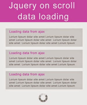
On scroll load data without refresh through Javascript

This article will discuss how to load data from server on scroll event of a page. We can see this feature on most of the sites like facebook and other shopping sites also. When we scroll down to the page data loaded by it self without refreshing the page. This feature can improve the user experience to the very high level.


First of all we need html with container div with data list div. we are going to load data from server through client side Javascript/Jaquery and server side c# Webmethod. Here we fetching data by webmethod and binding it with jquery.

But when we do this if we store id of data row at server side, it will create some problem when we go to next page and came back with browser back button.
That's why we are binding data row id to div and read it when we require.

In below html we are using 'loaddiv' to append data on page. On page load we are binding data through asp.net normally.


<!--/********************** Html **************************/--> <div id="loaddiv"> <div id="1" class="idholder"> Some data frome server1 </div> <div id="2" class="idholder"> Some data frome server2 </div> <div id="3" class="idholder"> Some data frome server3 </div> <div id="4" class="idholder"> Some data frome server4 </div> <div id="5" class="idholder"> Some data frome server5 </div> </div>


Now given below is javascript for calling asp.net webmethod and appending response to loaddiv. We reading data id of last list div and passing it to the webmethod.

JS for onscroll load data from asp <script type="text/javascript"> $(window).scroll(function () { if ($(window).scrollTop() == $(document).height() - $(window).height()) { loaddata(); } }); $contentLoadTriggered = false; function loaddata() { $contentLoadTriggered = true; idfecht = $('.idholder:last').attr('id'); $.ajax( { type: "POST", url: "<%= ResolveUrl("~/yourpage.aspx/GetDataFromServer")%>", data: '{divIndex: ' + idfecht + '}', contentType: "application/json; charset=utf-8", dataType: "json", async: true, cache: false, success: function (msg) { if (msg.d == "") { document.getElementById('btnmore').style.display = 'none'; } else { loaddata2(); $("#loaddiv").append(msg.d); $contentLoadTriggered = false; } } } </script> Webmethod will be something like this. You can write it in your way. But do not forget to bind data row id to the list div. [WebMethod] public static string GetDataFromServer(int divIndex) { int n = 100; string resp = ""; CLSyourclass object = new CLSyourfunction(); DataSet ds = new DataSet(); string searchval = HttpContext.Current.Session["preifxtext1"].ToString(); ds = objrec.Sel_morerecipebyidforAll(divIndex.ToString(), searchval); if (ds.Tables[0].Rows.Count > 0) { for (int i = 0; i <= ds.Tables[0].Rows.Count - 1; i++) { string divid= ds.Tables[0].Rows[i]["recipe_id"].ToString(); counter = Convert.ToInt32(divid); decimal rid = Convert.ToDecimal(divid); counter = rid; string yourstring = ds.Tables[0].Rows[i]["your column"].ToString(); resp += @" <div href='" + src.Replace("~/", "") + "' class='idholder' id='" + divid + "'>"+your next data+" </div> "; } return resp; } else { return resp; } }